PRODUCTS
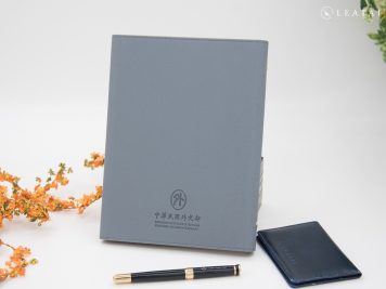
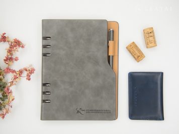
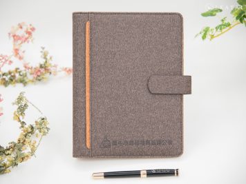
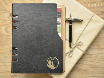
Being a Ministry of Foreign Affairs representative is an honor. The style is modest and understated, with a practical A5 mainstream size without being ostentatious and perfectly balanced.
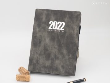
The camouflage-like style easily evokes the impression of special forces. Customized as a practical business helper, it is functional and visually intriguing.
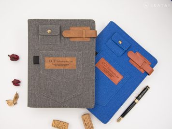
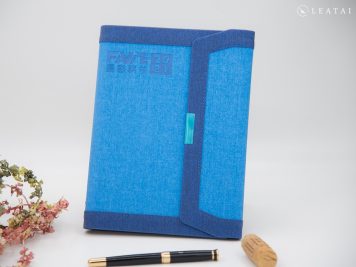
Boldly designed as a jeans-style binder notebook, this product has a solid and distinctive style, just like the image presented to clients. It’s practical and unforgettable.
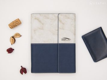
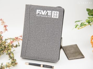
Ample is a leading international manufacturer of thick film conductor materials. It possesses extraordinary strength and impeccable taste to stand out in such fierce competition.
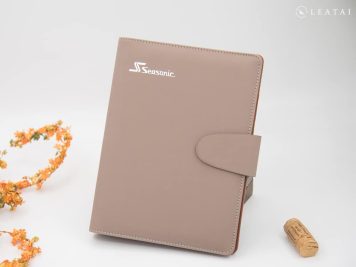
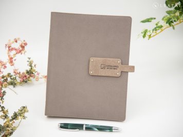
The central theme is a Morandi color scheme. The brand logo is placed at the bottom of the back cover, leaving the most visually comfortable area for the user. It is unobstructed by any graphics or text, making it grand and elegant.
Even if our editors are unfamiliar with linear guide rails, the pattern on the cover instantly makes the product’s function understandable. This design is a very considerate and recommended approach.
The editor still remembers that sometimes, when the other party goes out to sea on a mission, there is no internet communication available, causing a temporary interruption in communication. Defending the nation is indeed not easy.
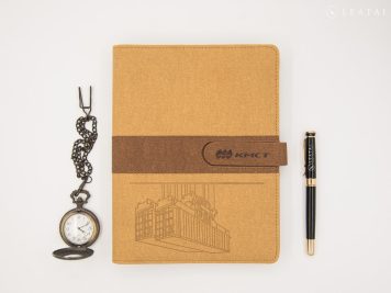
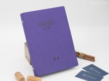
Minchali represents large-scale metal processing manufacturing, which laid the foundation for Taiwan’s early primary industries and livelihood. “Change” is a crucial core value.
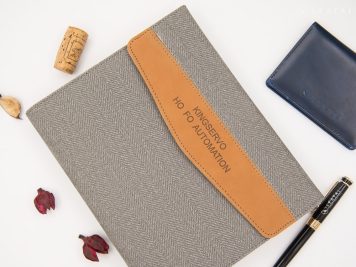
Not knowing automation is not a problem. The brand’s dedication allows you to feel its high-quality standards. The English-style elegance is full of literary charm.
It’s a super comfortable visual pairing comparable to premium quality. The customized inner page printing is also exquisite. How can a brand name be so perfectly balanced in its image?
Its importance as a national defense technology R&D institution cannot be overstated. The Morandi color scheme is understated and humble, while the customized inner page printing balances image and practicality.
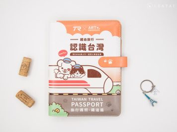
Adorable chibi-style artwork, with printing on leather being a challenging processing method, is a must-have for railway enthusiasts.
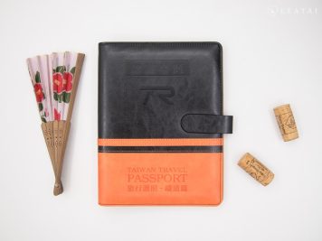
From a distance, it resembles the traditional colors of a train, making it ideal for use as a passport cover while traveling. It’s a collectible keepsake worth having.
As one of the critical pillars of Taiwan’s technology industry, the company’s logo is vibrant and distinct, symbolizing its prominent role in the sector. It is a name recognized by all, shining brightly within the industry.
The electronics industry often feels cold and impersonal, but this design exudes warmth. The brand name is presented in a literary and artistic font, making it a very human-centered brand.
The palm-sized dimensions make it compact and practical. Its cute and lively design fits easily in a bag without any burden. Highly recommended by female colleagues, it is in high demand.
The 48K planner is approximately palm-sized, making it portable. This size is highly recommended for customizing the original writing tools into a luxury visual experience.
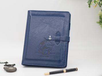
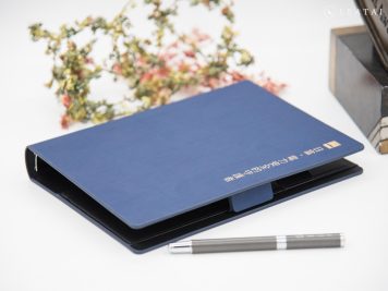
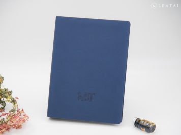
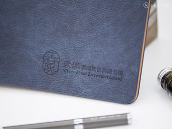
The deep blue gives a stable impression, much like the Military Police Command, emphasizing discipline and image. With a touch of mystery, it is an indispensable unit for maintaining national security.
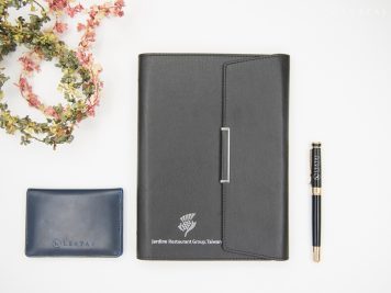
A large multinational restaurant group with renowned brands such as KFC and Pizza Hut, it is known for its highly successful operational model. The unique and memorable dishes introduced annually leave a lasting impression.
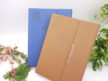
Based on its expertise in stone-related technologies, the company actively develops deep-sea water application technologies and ventures into the cultural and creative industries, earning great admiration.
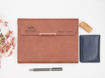
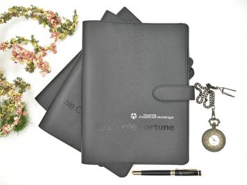
A large FinTech enterprise in financial flow, its core culture is centered on value innovation and practicality. The style balances humanity and warmth, being relatively low-key and modest yet with considerable strength.
The association highly values professionalism, demonstrates technical strength, and emphasizes a stable and reliable image. This makes it a trustworthy presence.
Guardians of electricity safety and maintaining society’s normal functioning are crucial in today’s environment of energy scarcity. Let’s support Taiwan together.
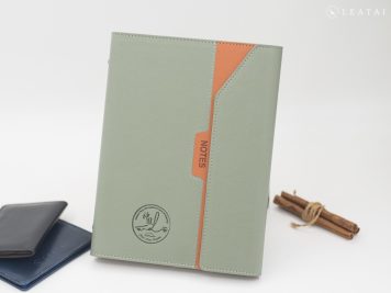
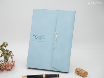
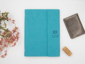
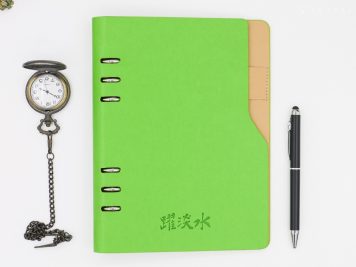
We take the spirit of “Be like water” as its guiding principle and use a lake green color scheme as its central theme, subtly embodying the brand’s image. This approach is akin to the profound wisdom in the saying, “Be water.”
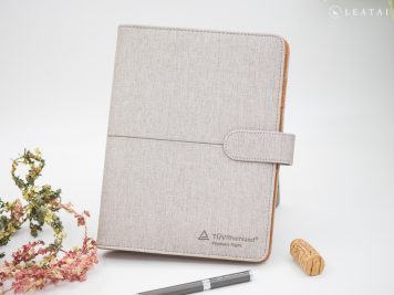
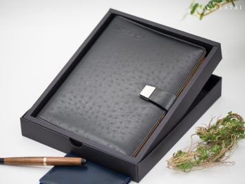
TUV Rheinland is committed to creating a harmonious future where humans and the environment coexist. This brand image is presented with great elegance and comes packaged in a paper box, nearly matching the standards of a high-end gift box.
A pioneer of the new honeycomb-style business model, embodying the spirit of fearless exploration. Steady management has garnered widespread recognition, making the journey to success worth learning from.
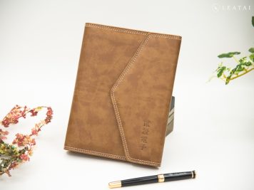
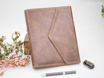
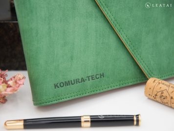
The retro envelope design, paired with the rare matte green color, showcases a unique taste, deliberately adding a touch of rebellion to tradition.
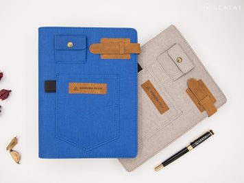
Continuing the previous rebellious vibe, this time, it boldly adopts a jeans design, instantly giving a refreshing image. Unlike traditional Japanese businesses, it certainly leaves a deep impression.
Placing the core spirit in the center of the back cover emphasizes the importance of caring and demonstrates the brand’s unwavering dedication. The ability to persist is the key to success.
With dedication, everything should be displayed to the fullest. A beautifully crafted notebook gift box for the most important clients—executing the fine details to this standard is remarkable.
PAX Global has specially debossed its logo horizontally, making this binder look as exquisite and tasteful as a clutch bag.
As a representative of a large corporation, it has become the industry leader through steady management. Customized leather materials are required to meet their needs, and custom-printed inner pages showcase their refined taste.
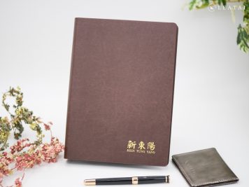
Regarding Hsin Tung Yang, one immediately thinks of pork jerky and other gift items. It is no easy task to match colors prominently, instantly reminding people of their flagship products.
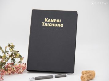
One of the top contenders in the yakiniku industry, Kanpai Classic undoubtedly lives up to its reputation. The success of their operations is no accident, as the brand’s steady aura conveys an image of unwavering stability.
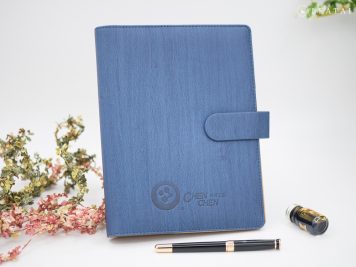
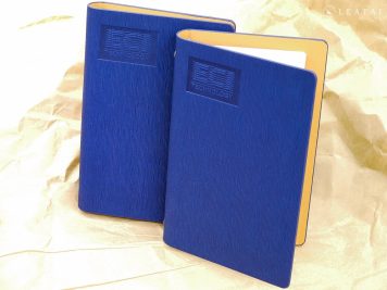
It is imposing to transform a traditional construction giant into a simple yet elegant image. The steady matte blue color directly conveys a sense of reliability.
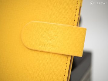
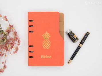
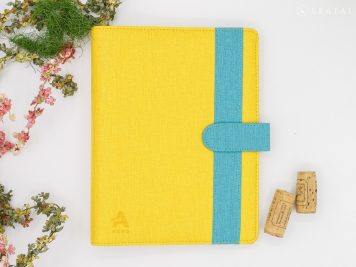
Produced in a compact size, with the symbol of Want Want embossed in gold at the center, the bright orange color conveys a vigorous ambition, seemingly unstoppable.
In recent years, Taiwan has focused on developing new energy sources, which hold great potential for the future. Like the brand’s vibrant color choices, this new energy brings endless possibilities for people.
Custom-made ring binders for senior management, with personalized inner page printing, balance practicality, and aesthetics. They are essential tools for overcoming challenges.
Writing is an instinct that won’t be rendered obsolete by the passage of time. In today’s society, this is a rare collective need within communities, indicating a high-quality cultural environment.
As a highly disciplined military unit, attention to detail is paramount. This meticulous approach is reflected in the writing planner, maintaining the same rigorous standards.
Taiwan’s first high-performance liquid chromatography component precision machining supplier is known for its exceptional professionalism, technical expertise, and distinct and striking style.
ECI is an international high-tech enterprise, and such a professional image is best conveyed through a deep, steady blue.
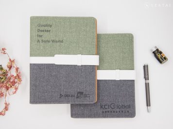
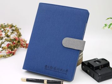
The deep blue paired with gray creates a balanced visual contrast that is neither strong nor weak. This combination conveys a steady image while maintaining a touch of lightness.
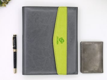
Corporate growth involves presenting the brand’s colors as crucial. Juluen, with its primary colors of gray and green, showcases a unique aesthetic of contrasting beauty, which is worth learning from.
Combining traditional Chinese medicine with modern science can enhance therapeutic effects. Maintaining the core values of conventional remedies during transformation ensures safety and reliability, which are crucial for steady growth.

